Antibiotic Allergy Stewardship
SHEA
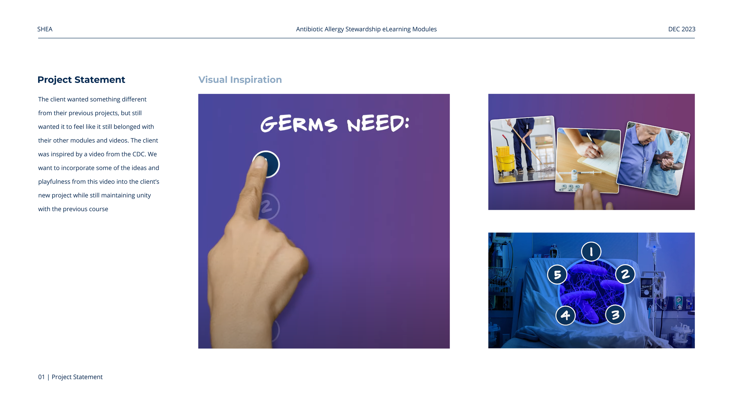
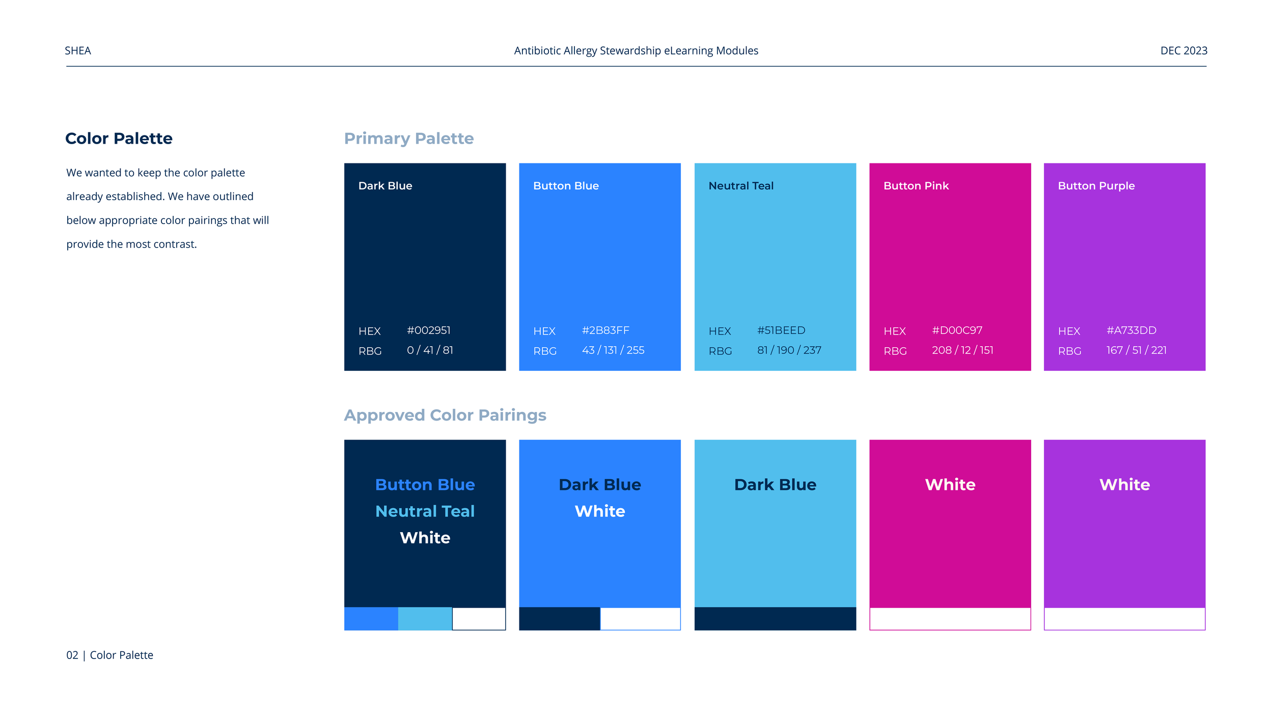
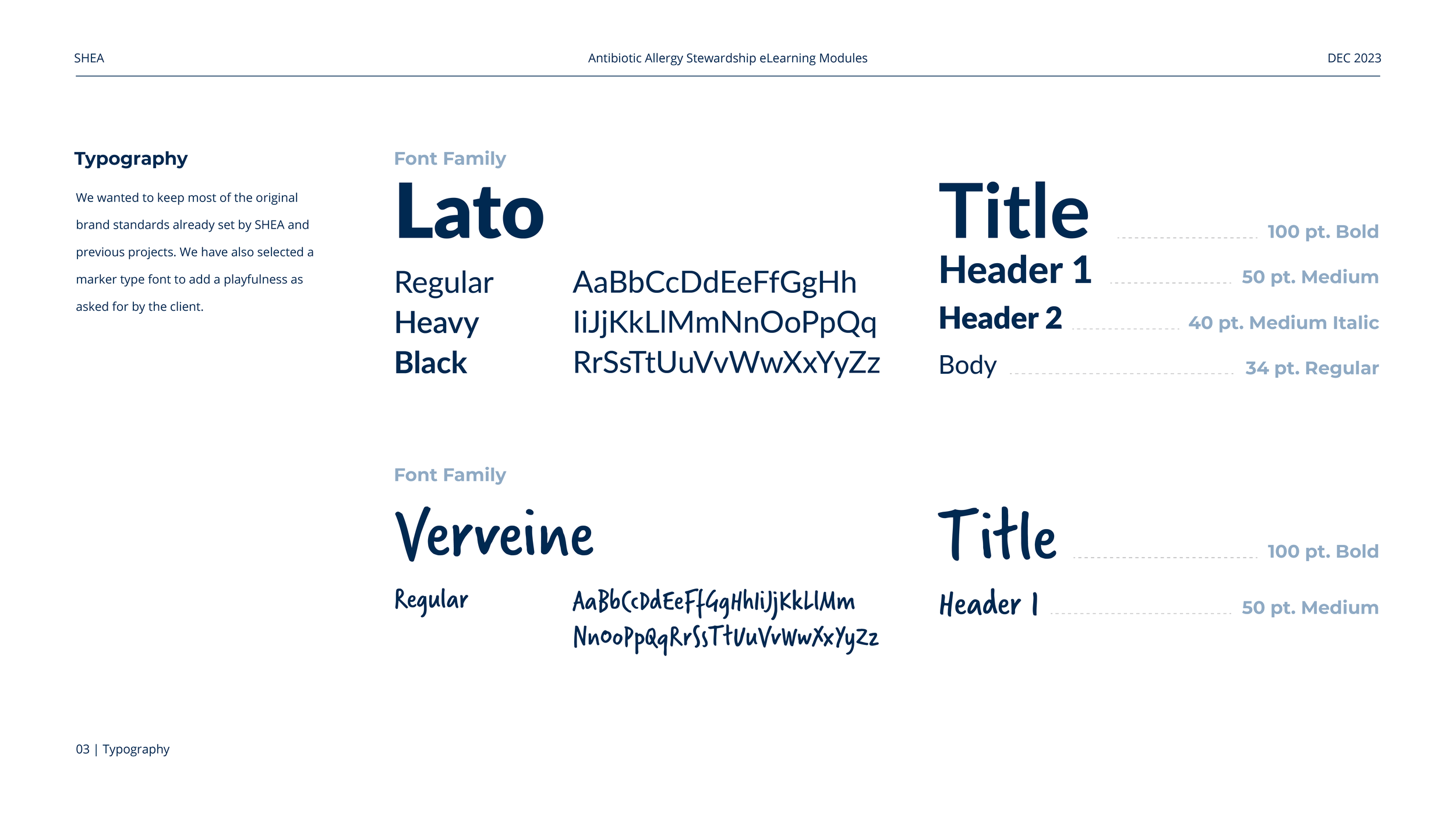
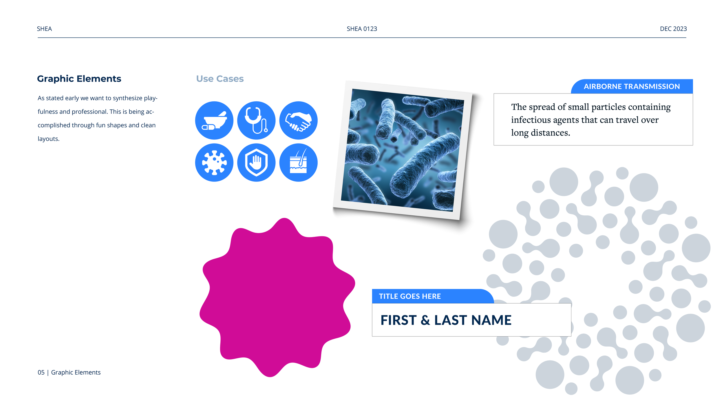
In order to keep their audience engaged, SHEA wanted this board to be fun and playful. We achieved this by adding purple and pink to the bright colors already found in their brand palette, to create an analogous color scheme. Gradients and photo-realistic elements, like the frame that features the polaroids and the cut-out hand, were then used to create a sense of reality along with absurdity. Finally, the typefaces Lato Bold and Verveine aided in balancing the playful and professional tones.