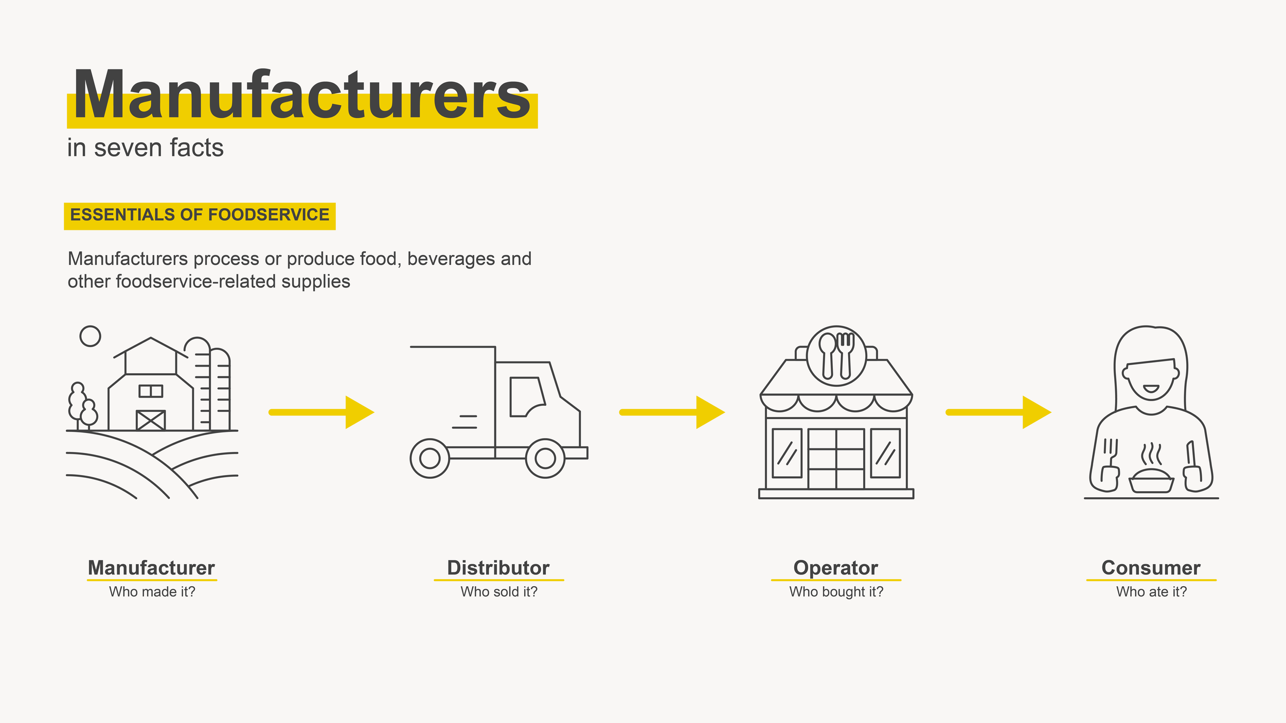
Essentials of Foodservice
IFDA
Derived from an existing powerpoint this client had, the color palette of this video series is best described as “comfy” and soft, while still being quite saturated and providing adequate contrast. Since these were videos about the process and elements of foodservice, they needed to be clear and easy to understand, so we used Arial bold, a simple standard sans serif font. We used line icons, color highlights on titles and labels, and colorful photo cutouts to add detail throughout the design. Aside from this, we kept the decorative elements to a minimum to keep the focus on the content.